Finding bad flamingo drawings with recurrent neural networks
Have you played Quick, Draw! yet? It’s basically Pictionary, played against a neural network, and it’s a lot of fun. Not long ago, Google released a dataset of some of the millions of sketches people have drawn so far over 345 categories.
In this post, I’ll just be looking at sketches in the ‘flamingo’ category. You can browse a random sample here. Some of them are lovely.

Others, well…

What if we want to automatically identify the jankiest flamingos in the dataset?
Sketch-RNN as probability estimator
Along with the datasets, Google has released some pre-trained models that use the Sketch-RNN architecture described in this paper.
These models were trained to generate new sketches. For example:

But we can also repurpose them to get some insight into existing human-generated sketches. As I talked about in an earlier post on character-level RBMs, learning to generate new examples of X is basically the same as learning the probability distribution of X.
So in addition to sampling from the learned distribution to generate new sketches, we can take existing sketches, and ask the model how probable it thinks they are. It seems reasonable that the sketches the model assigns the lowest probabilities should be among the ‘worst’.
Good flamingos
Before we roast Quickdraw’s least gifted flamingo-drawers, let’s look at some of the ‘best’ flamingo sketches - i.e. those assigned the highest probabilities:

Audubon they ain’t, but these are at least mostly recognizable as flamingos. Because we’re ranking by probability, we should in some sense expect the most ‘typical’ sketches here, rather than the most beautiful.
Bad flamingos
To quote Tolstoy, happy flamingos are all alike, but every garbage flamingo is garbage in its own way.
We can broadly classify our worst birds into a few groups.
Well-intentioned but frankly awful
God bless these artists, they really tried.


You can check out some more examples here.
Scribbles


In most cases, the artist started out with something flamingo-like, then scratched it out in frustration. The Quickdraw dataset encodes sketches as a sequence of pen strokes, rather than just a grid of pixels, so we can actually reconstruct the history of sketches like this:
Cheating attempts


Wrong category


There are some cases where the artist was pretty clearly drawing a different Quickdraw category like ‘pineapple’, or ‘compass’. It’s not clear whether it was a glitch that landed these images in the flamingo dataset, or user error (maybe the players didn’t realize they ran out of time and were given a new category?).
Have you ever even seen a flamingo?


More head-scratching examples here. The ‘wrong category’ explanation doesn’t work for most of these, because they don’t look like any of Quickdraw’s other categories (for example, there are no categories for ‘beaver’, ‘sitar’, or ‘female skeleton doing aerobics’).
Graffiti

Some scoundrels just treated Quickdraw like a bathroom wall. The uncensored version is here (NSFW).
The unjustly maligned


Most of what I found was garbage, but the three above are actually kind of gorgeous. Add some colour to #3 and it could be a New Yorker cover! What gives?
These are great drawings, and pretty recognizable as flamingos, but that doesn’t count for much. We’re not ranking by how clearly these images represent their subject (i.e. P(category=flamingo | drawing)), but rather how likely someone is to come up with this when asked to draw a flamingo (P(drawing | category=flamingo)).
Very few people would think to draw the legs and head, with the body out of frame, as #3 does. #1 uses unusually many short, disconnected lines, and #2 uses a unique stylized head shape.

The drawing above is another good example. Flamingos do bend their heads down low like that, but when asked to draw a flamingo, almost no-one thinks to pose it with its head below the horizon.
You can browse a gallery of all the bottom 400 flamingos here (warning: contains a few NSFW sketches).
Is this useful?
It totally could be!
Google described their dataset as being ‘individually moderated’, and you can scroll through the examples here for a long time before hitting any graffiti (and if you do find any, you can even click it to ‘flag as inappropriate’). It seems they’ve already done a pretty good job of filtering out most of the irrelevant/malicious sketches that were surely rampant in the raw data.
But this approach was able to easily identify a subset of sketches containing a high density of overlooked graffiti, scribbles, and irrelevant sketches. And it’s quite ‘cheap’, since it uses an existing model trained for a different purpose. If we wanted to go further, this would be a good place to start to get some labelled examples to bootstrap a graffiti classifier.
Appendix: Measuring probability
(Warning: There are no more funny flamingo sketches ahead, just boring technical details.)
I’ve been talking about measuring the ‘probability’ a Sketch-RNN model assigns to each sketch, and ranking by those probabilities, but the truth is a little messier. There are a few complications we need to consider here.
Probability vs. probability density
Sketch-RNN models the location of the pen as a continuous random variable. In this view, the probability of any stroke’s (x, y) position, and therefore of any sketch as a whole, is 0. So it makes more sense to talk about measuring the probability density of sketches. If A’s density is twice B’s, then A is in some sense ‘twice as likely’. (Both sketches still have probability zero, but we can measure a non-zero probability for the set of similar sketches in some tiny neighbourhood of equal size around A and B, and the probability near A will be twice as high).
Varying lengths
Sketch-RNN outputs probabilities (/densities) per stroke. The natural way to get the probability (density) for a sketch as a whole would be to multiply the values for each stroke. (Densities can be multiplied together much like probabilities.)
However, the number of strokes per drawing in the dataset varies:
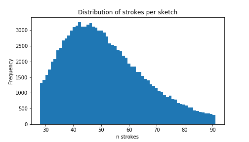
A priori, we’d expect longer sketches to be less probable - every time we multiply probabilities, we get a smaller number. In language modeling, we’d control for this by measuring the perplexity per word of a sentence or longer text. We can do something similar here, and measure the density per stroke.
(An interesting twist is that sorting by non-normalized densities, the sketches with the lowest and the highest values were biased toward having more strokes, which completely broke my intuition. The reason for this is that, unlike probabilities, densities can be greater than 1. If the strokes in a sketch mostly have densities greater than 1, then adding more strokes leads to a higher overall density. This doesn’t mean that strokes S_1, S_2, S_3 are more likely than their prefix S_1, S_2 (that’d be weird). It means that comparing the values of density functions with different dimensions is generally a bad idea.)
What I actually did
I sorted on formula (9) in this paper - the reconstruction loss. This is basically the log density of the sketch (times the constant, -1/N_max). A minor deviation from (9): L_p, the loss with respect to pen state, is summed up to the number of strokes in the sketch,N_s, not the maximum strokes per sketch,N_max. (This is actually a hidden feature of the code when running in evaluation mode. I’m not sure whether the loss figures they reported e.g. in Table 1 include this tweak, but I’d be surprised if it makes much difference.)
The Bad Flamingos page sorts by the loss function normalized by number of strokes. The examples on this page were mostly selected from the sketches with the worst unnormalized values. Qualitatively, both metrics gave pretty reasonable results with a high degree of overlap, but I ended up preferring the normalized version because its bottom N had a more representative distribution of lengths. The fact that unnormalized loss worked at all is basically a fluke and not something to rely on - if you rescaled the (x,y) values of pen positions to different units, it could drastically change the sort for unnormalized loss, but it wouldn’t affect loss/nstrokes.
All the code for this experiment is available here.
Tagged: Machine Learning