Hell has more than 7 circles you guys
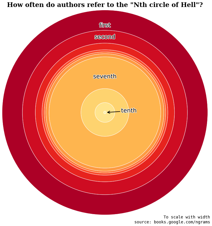
I recently created this graphic from the Google Books ngram dataset, mostly as an excuse for visual punnery. It compares the frequency in books of the phrases “first circle of Hell”, “second circle of Hell”, “third circle of Hell”, etc. The width of each ring corresponds to its frequency:
Pop quiz: how many circles does Hell actually have?
When we talk about a Hell divided into circles, we’re usually referring to the model described by Dante in his 14th century poem Inferno. And according to Dante, Hell has nine concentric circles “representing a gradual increase in wickedness”.
I would expect that, for poetic reasons, writers would be most likely to refer to the extremes – the innermost and outermost circles. But this isn’t the case. The most frequently referenced circle, by a significant margin, is the seventh. In Dante’s Hell, the seventh circle houses the violent (the eighth is for fraudsters, and the ninth and innermost is for traitors). As far as I can tell, there’s nothing particular about the seventh circle that makes it stand out from the others in the Inferno. So what gives?
Could it be that a lot of people actually underestimate the size of Hell and think that the seventh circle is the innermost? The ngram data for “N circles of Hell” seem to support this hypothesis:
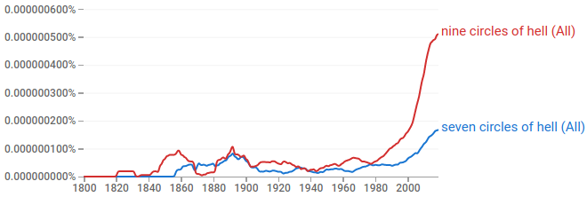
(Other values of N barely register on this scale)
One possibility is that these books are referring to a conception of Hell other than Dante’s. According to Wikipedia, sevenfold cosmological schemes have been common since ancient times. For example, the Islamic hell, jahannam, is said to have seven levels.
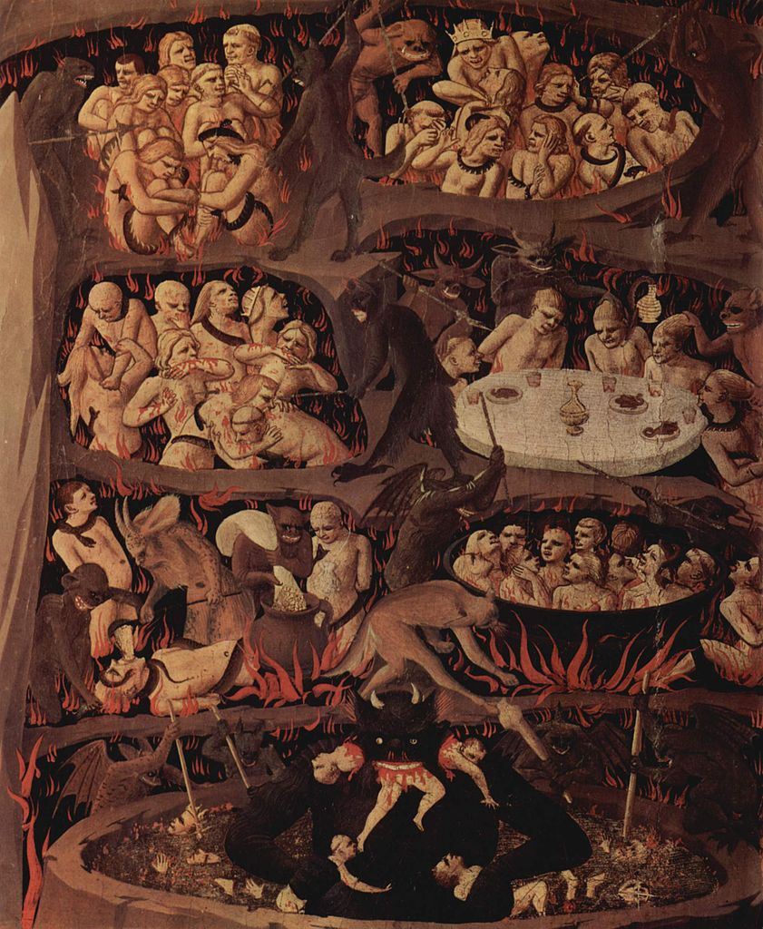
Browsing Google Books search results for “seven circles of Hell”, a little more than half are in fact referring to other schemes. For example, there are a number of discussions of Fra Angelico’s The Last Judgement (painted around 100 years after Dante’s Inferno), which includes this seven-sectioned depiction of Hell:
But still, that leaves a lot of people fumbling their Dante lore. And we’re talking about published authors here! Even Victor Hugo makes the following goof in Les Miserables: (in reference to a convoy of men in chains) “Dante would have thought he saw the seven circles of Hell on their passage.”
Here are just a few more examples found via Google Books search…
From the 1985 popular science book Quantum Reality:
Dante’s picture of this world as a series of concentric spheres – heaven the largest; next, the planets’ crystalline spheres; down through our Earth’s concentric “elements,” the whole supported by the seven circles of hell – gave everything and everyone his proper place…
The Development of Western Civilization - Volume 1 (1941):
The two journey through the seven circles of Hell where they see those who had committed evils and where Dante meets and converses with the shades of departed friends and enemies.
The Gulf: Arabia’s Western Approaches (1979):
On having this explained to me, I found myself thinking gloomily of Dante’s Inferno and the seven circles of Hell, and it came to me there was a certain aptness in the analogy…
A Google News search for “seventh circle of Hell” finds it’s overwhelmingly used in a way that suggests it’s the innermost or worst part of Hell, e.g.:
He rents a room in a seventh-circle-of-hell-style basement apartment in Trenton, New Jersey
Was last season’s 101 losses Dante’s seventh circle of hell or was that only the sixth level?
Fake TripAdvisor reviews: Auckland hostel wrongly slammed as ‘seventh circle of hell’.
The train carriage, which was “hotter than the seventh circle of hell”, prevented Noa from napping, which ultimately led to a cranky baby.
It’s unclear why this particular confusion is so persistent, but the two major factors I would propose are:
- The joy of alliteration
- A false analogy with the seven deadly sins. The circles of Dante’s Inferno don’t exactly map to the seven sins of pride, greed, wrath, envy, list, gluttony, and sloth. But if you have only a casual knowledge of the poem, it’s not unreasonable to guess that they would! (In fact, Dante’s purgatory, covered in the second part of the Divine Comedy, is organized this way.)
The latter theory is echoed in one of the more amusing excerpts I found while searching Google Books, a chapter from Lillian Robinson’s In the Canon’s Mouth in which she drags the editors of the Norton Anthology of Literature by Women for a number of errors, including miscounting the circles of hell:
Note number five, at the end of the following line, tells us that Austen wrote six novels (well, she completed six), that the humours “were thought” (by whom? when?) to control a person’s psychological makeup, and that there are seven circles of hell in Dante’s Inferno. So there are, so there are, but then Dante, Virgil, and the reader proceed together to an eighth and a ninth! These deepest circles, harboring false counselors, cheats, and traitors, are an integral part of Dante’s scheme…
…Let Dante, wrapped up as he was in multiples of three and ten and making it all fit together without wrenching the divine sense, spin in his grave–adding a whole new light show to Paradise, perhaps. Anyways, maybe he brought it on himself by structuring the Purgatorio around the Seven Deadly Sins.
A remark on perceptual fidelity
You know how people like to trash pie charts for being hard to interpret, because our lizard brains are bad at accurately judging relative size differences of wedges of a circle? The “bullseye” format of the chart I led off with has a similar problem, except far worse. Because each ring surrounds a different size hole, if the data for each ring is scaled to its width, the areas will be way out of proportion, and vice versa. Here’s a side-by-side comparison with a version scaled to area:
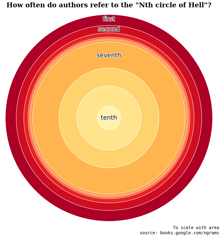
It looks wildly different. It’s not intuitively obvious which one ought to be more perceptually accurate. Is the first one making the innermost values seem smaller than they really are and artificially inflating the outer values? Or is it the second one that’s doing the opposite?
Here’s the same data presented with the gold standard of a good old bar chart:
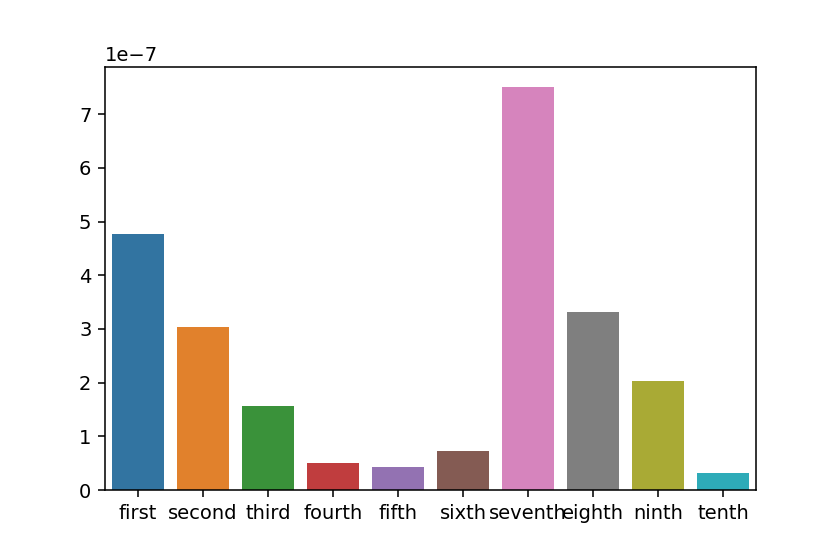
Compared to this groundtruth, the width-scaled version rings a lot more true. But still, probably better to avoid this bullseye chart format for any serious purposes.
The source code for munging and visualizing the data discussed in this post is available on GitHub here.